Analyzing an admixture of categorical and numerical variables.
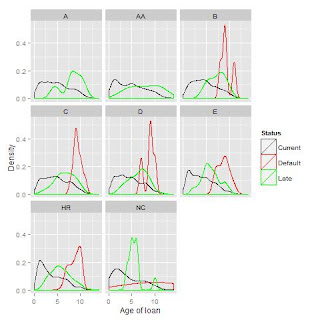 |
Trellis chart of loan age distributions faceted by
clients' credit levels & loan status. |
This time I look at visualizing p2p loan data which is mostly categorical in nature (factors rather than numeric). While reproducing the charts in the book was somewhat challenging, I also went a step further and revealed some expected patterns as well as some surprising deviations.
First I created the density plots. This was straight forward in R. I did decide to transform one of the variables with a log function. Since it had zero values those rows were dropped. So I added a minimal increment to all the values and got them back in. I had thought the graphs were not so elucidating so I explored them further and when I faceted them further into trellis graphs (by credit ratings) some interesting patterns started to emerge.
These charts provide a high grain view of the data. One can easily interprets the interplay of 4 variables. Which are not visible in the aggregate views provided in the text.
As might be expected at the first maximum of the Loan Distribution we see the the beginning of the Default maximum. This would come about because before defaulting the loan taker would be maximally late.
What is perhaps surprising is that at some credit B and D levels there are two peaks in the distribution of Defaulting while at the others exhibit a single peak
However since the code loads, installs and saves - it is not so easy to read.
Ggplot2 is lacking the ability to generate a Spineplot, though I provide a link showing how these might be created one rectangle at a time. I showed a couple of close hits but no success - this comprises the contents of the first file bellow. While researching this I leaned a bit about ggplot2 stats feature and I found that spineplots have been commented out of ggplot2's source.
Once I gave up on ggplot I quickly got good the required chart. R has a simple command to generate a Spineplot. I am skeptical as to the effectiveness of a Spineplot is as a visualization option for information.
Further reading


Comments
Post a Comment